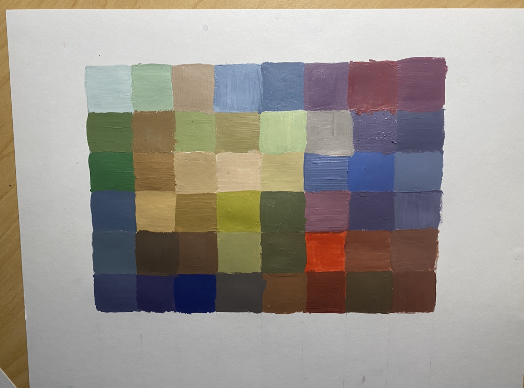
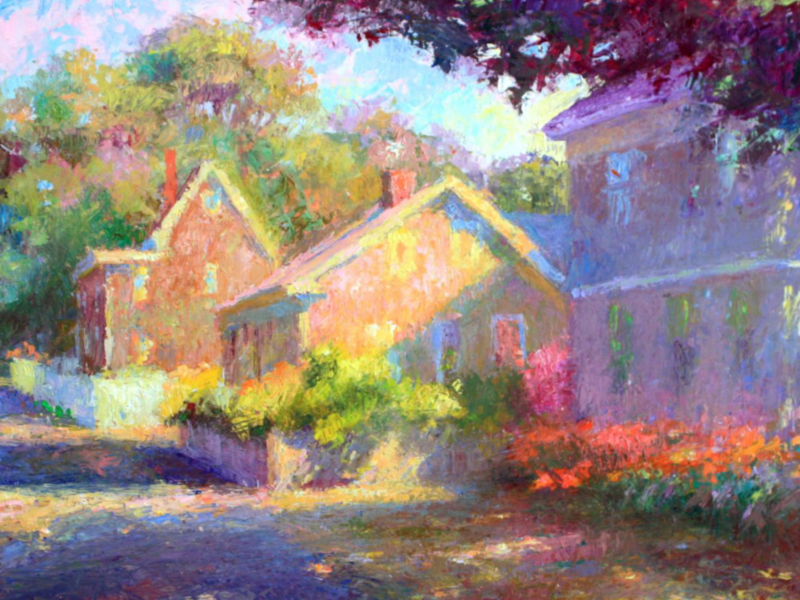
I chose to work from a Hilda Neily painting to create my pixel chart. I took an impressionism workshop with her over the summer during high school, and I really admire her use of vibrant color, so I thought she would be a cool reference for this project!


3 Comments
That one pop of red square does wonders! You chose a beautiful reference painting, and my first thought was that your pixel painting is a slightly more “primary” translation of the original pastel piece. Not sure if this was intentional but I’m glad you took some liberties with intensifying some of the colors, your final piece is definitely more captivating than the actual pixel reference!
This looks so good, I love the vibrant colors you put in there. I definitely think this is a good representation of your inspo photo as well.
This is so beautiful!! I love the variety of green and blue. You did a great job in making each color stand out and I love the red square in there; just like Sarrah said “…it does wonders!” When I look at it, it reminds me of the rabbit’s hole in “Alice in Wonderland”; behind it, there is a whole new universe. Good job!