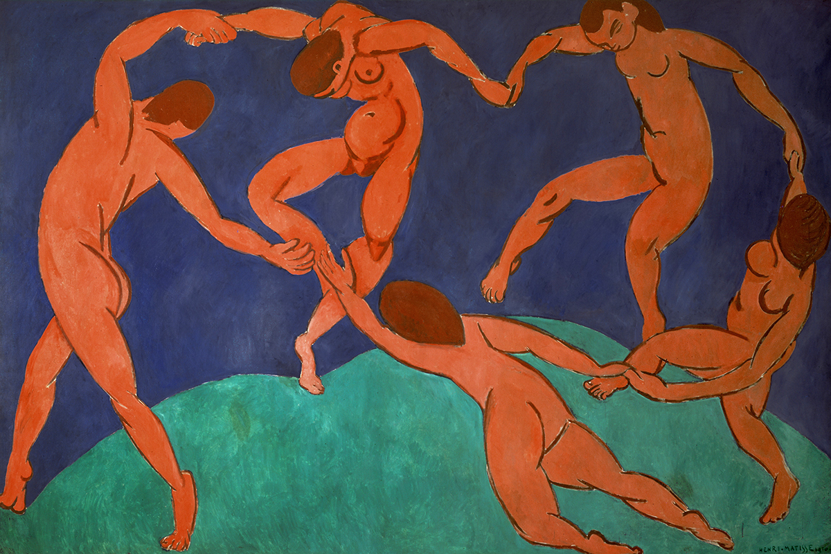
Artist and Piece: Matisse’s The Dance
Colors: Orange and Blue (tints & shades)
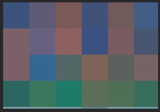
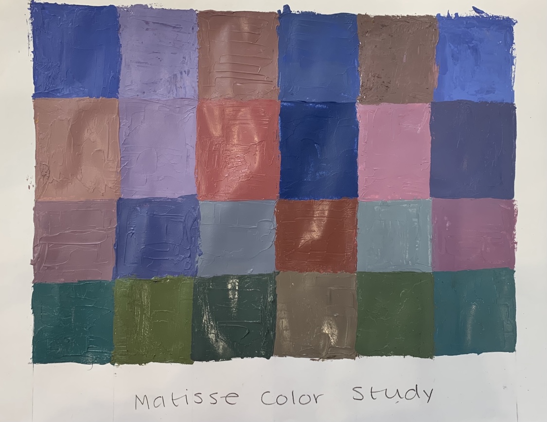
It was difficult to make the green colors and shades without phthalo green, so I added a small amount along with black for the bottom row. Maybe I should have added more yellow to the greens instead of my orange mixture?
2 Comments
Lovely work Devynn, now you must go to the Barnes Foundation in Philadelphia to see their Matisse collection. Good exploration of close value tones. You had a tricky one with limited greens but did a fine job.
That bottom row of earthy green pixels is just gorgeous!! You did a good job of defining those soft value shifts. Sad part about pixelating feature is that it averages values and takes away a lot of vibrancy from the reference painting; it would have been so fun to include a pop of that bright orange that Matisse uses in the original!