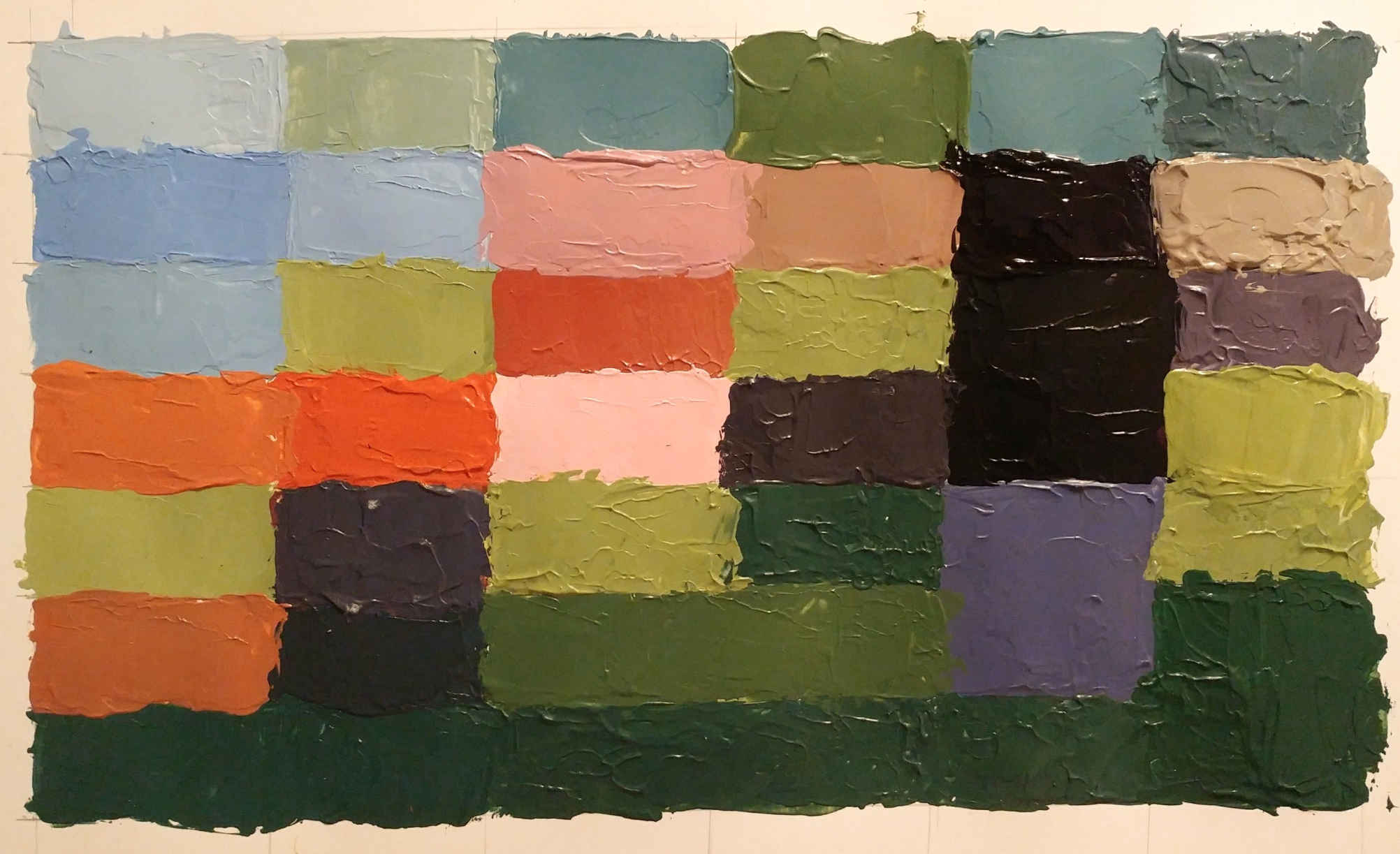
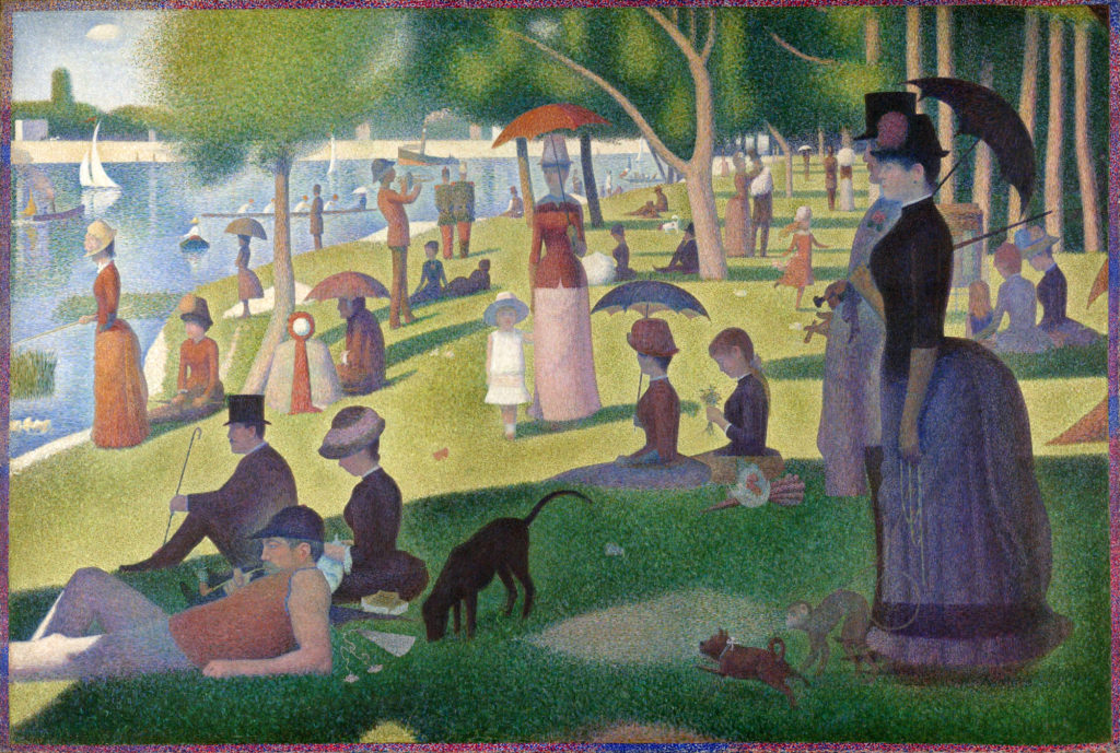
Nice color translation of Seurat. Is the bottom row all one color green or is that a trick of the photo? Also the beige color swatch on the upper right corner looks like it is possibly over-tinted. Perhaps it needs a bit more warm temperature. Let’s chat and take a look. I love the hot pink tint in the center surrounded by oranges to the left. Very nice work.
Beautiful work J! Your blue tints are spot on. For your bottom row, to make the greens more differentiable I suggest working (very) trace amounts of white and red to make those lighter, more muted greens!

2 Comments
Nice color translation of Seurat. Is the bottom row all one color green or is that a trick of the photo? Also the beige color swatch on the upper right corner looks like it is possibly over-tinted. Perhaps it needs a bit more warm temperature. Let’s chat and take a look. I love the hot pink tint in the center surrounded by oranges to the left. Very nice work.
Beautiful work J! Your blue tints are spot on. For your bottom row, to make the greens more differentiable I suggest working (very) trace amounts of white and red to make those lighter, more muted greens!