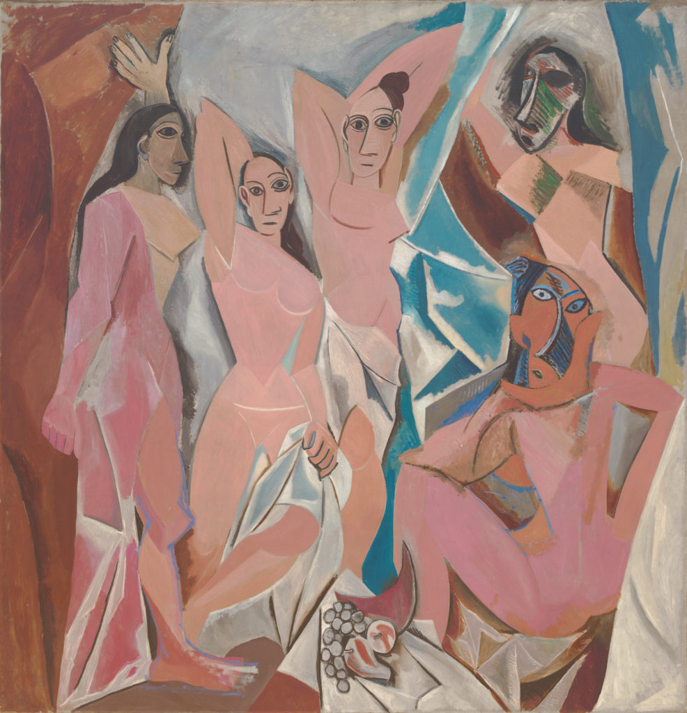
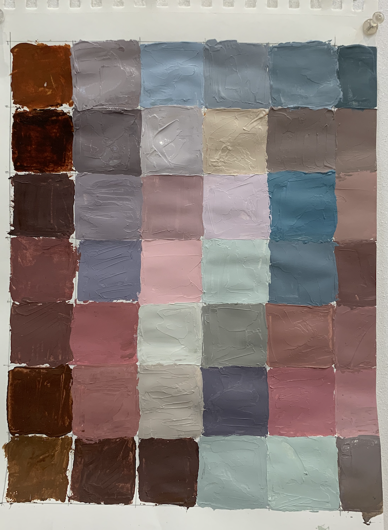
Nice work on Picasso Pixel painting. The brown squares at the base could be more tinted, they look a bit dark in comparison with the painting. Our 3 choices for color mixing are Value, Saturation and Temperature. You could add more white and perhaps a touch of blue. Try and paint color to color and have no white paper showing. It creates more of a illusion.
Beautiful job! Deirdre already mentioned this, but I would also suggest tinting your left-most column, it will really help balance the composition. Would also suggest warming up your top two rows for warmer/pinkier greys! Otherwise beautifully done and so neat!

2 Comments
Nice work on Picasso Pixel painting. The brown squares at the base could be more tinted, they look a bit dark in comparison with the painting. Our 3 choices for color mixing are Value, Saturation and Temperature. You could add more white and perhaps a touch of blue. Try and paint color to color and have no white paper showing. It creates more of a illusion.
Beautiful job! Deirdre already mentioned this, but I would also suggest tinting your left-most column, it will really help balance the composition. Would also suggest warming up your top two rows for warmer/pinkier greys! Otherwise beautifully done and so neat!