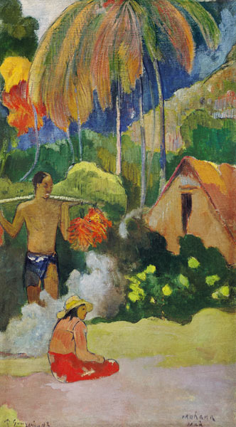
Your greens are luscious and varied! Nice work on all of the subtle tones as well. You might consider increasing the saturation of the cadmium red and ultramarine blue based on the painting and not look at the pixel computer translation for the final pass. Beautiful craftsmanship too!
Beautifully done! That pop of red is perfectly balanced, and I agree with Deirdre’s suggestion of amping up that royal/ultramarine blue in just even one of the top right squares to better reflect the original, since the pixelating feature can dull so much of the original painting’s impact.
2 Comments
Your greens are luscious and varied! Nice work on all of the subtle tones as well. You might consider increasing the saturation of the cadmium red and ultramarine blue based on the painting and not look at the pixel computer translation for the final pass. Beautiful craftsmanship too!
Beautifully done! That pop of red is perfectly balanced, and I agree with Deirdre’s suggestion of amping up that royal/ultramarine blue in just even one of the top right squares to better reflect the original, since the pixelating feature can dull so much of the original painting’s impact.