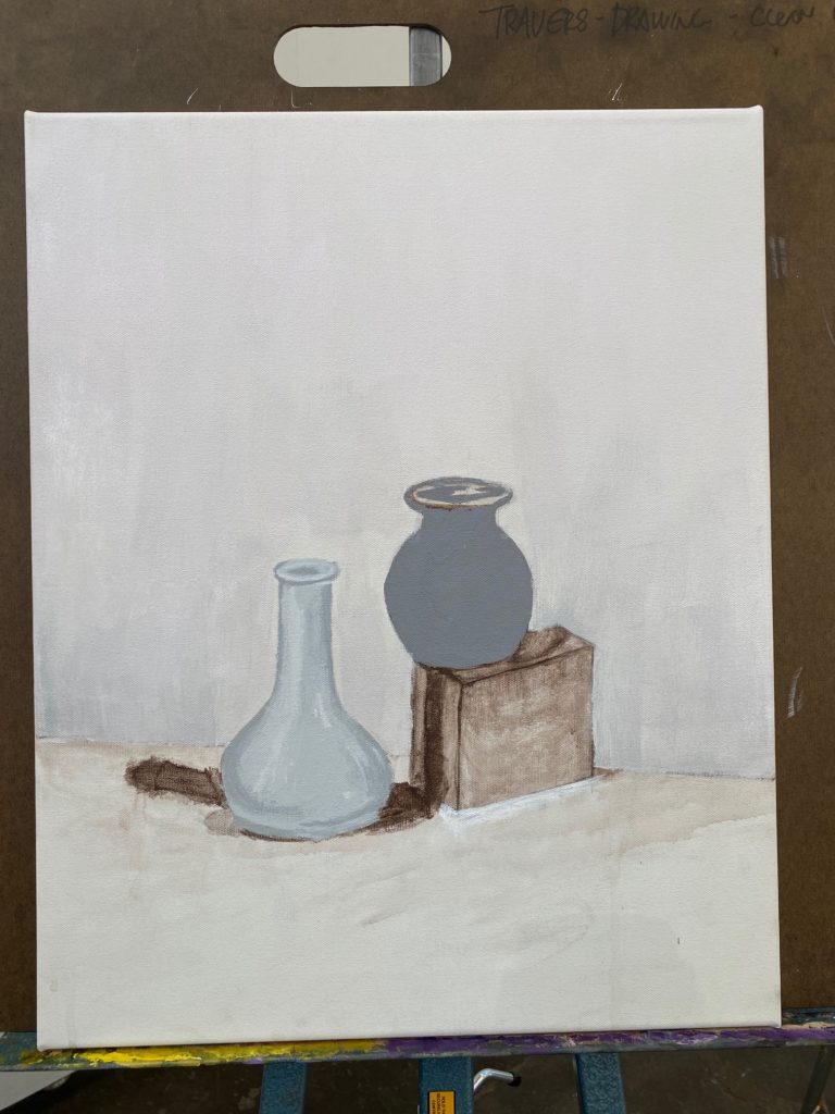
Final!
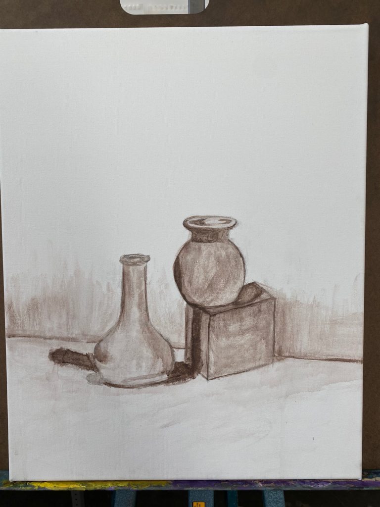
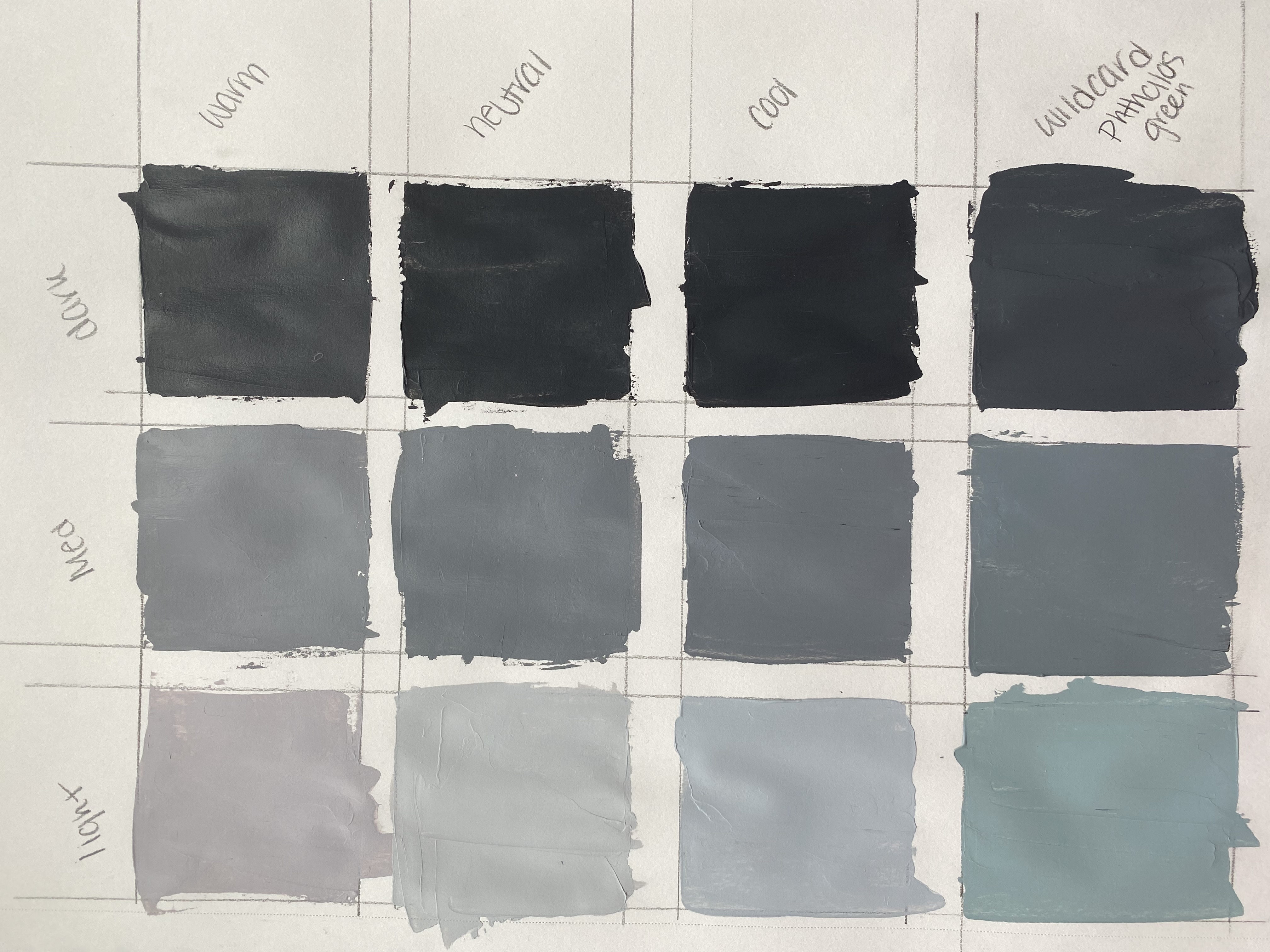
3/2: Finished day 1 of using grey. Warm tone on small pot, cool on left vase, pinkish purple to tinted version as you go from top to bottom in background.
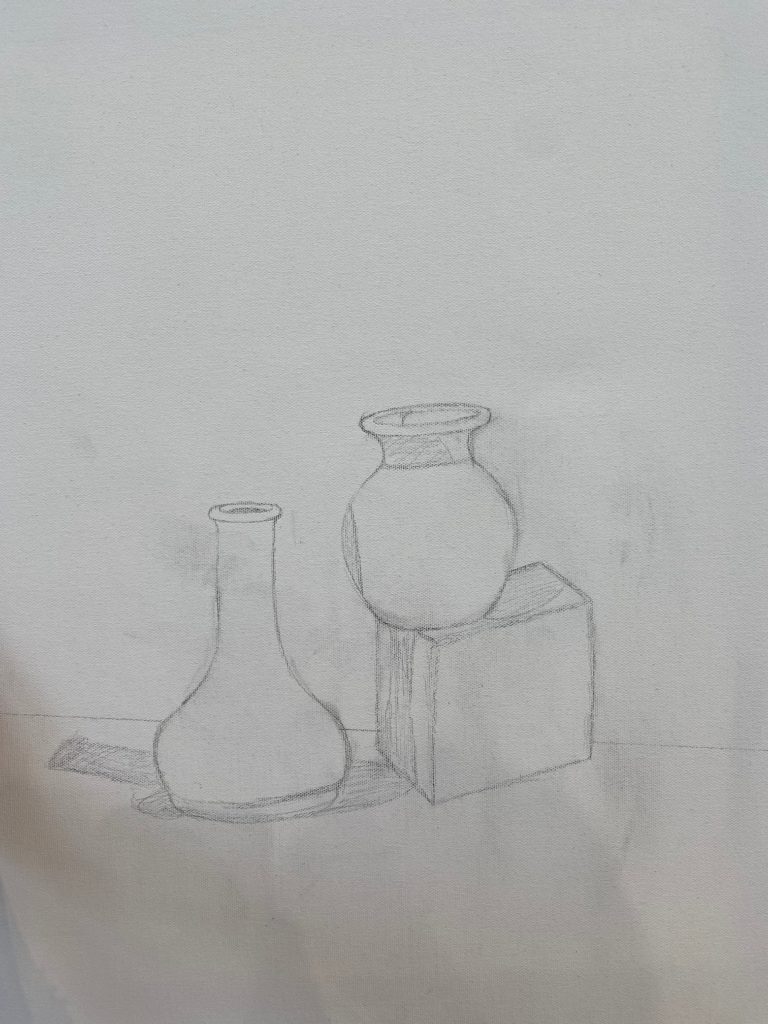
3/1: I didnt take a photo of my underpainting but will take and upload asap!
I used crimson to make my warm tone, our bright blue that I’m suddenly forgetting the name of, and phthalos green as my wildcard!
5 Comments
I really love the shades you made in your greyscale swatch layout. The blue-is shades will look so beautiful with your still-life!
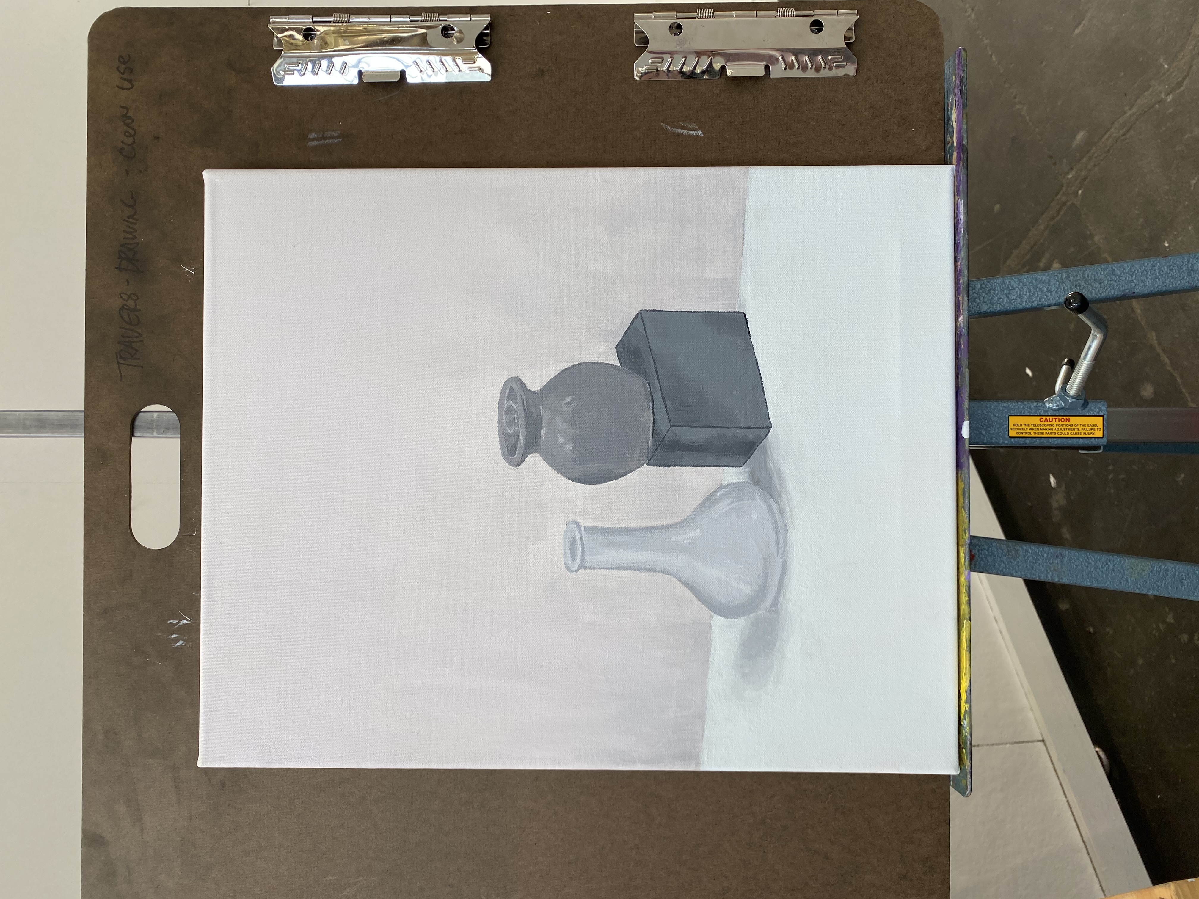
I think this is looking really great. I love how you captured the highlights and shadows in the tall vase, it really captures its form. Also, your painting overall looks very smooth texturally in a calming way.
Wonderful progress! Like Teasha mentioned, your still life is so clean and calming. Also, since you have so much wall/table space in your painting, I would suggest honing on the temperature shifts in these areas as well to create a captivating composition. It will transform your background from just a flat space into a dynamic space
The final product is beautiful! So clean, minimal, and refreshing to look at. The pinky warmth of the back wall is so comforting 🙂 and great job with the highlights on the objects! They perfectly compliment the depth and curvature of each object.
Wonderful sensitive use of temperature grays and soft transitions to give a calming effect to your painting. William Bailey is your new mentor, http://www.bettycuninghamgallery.com/exhibitions/william-bailey6
Keep up the good work.