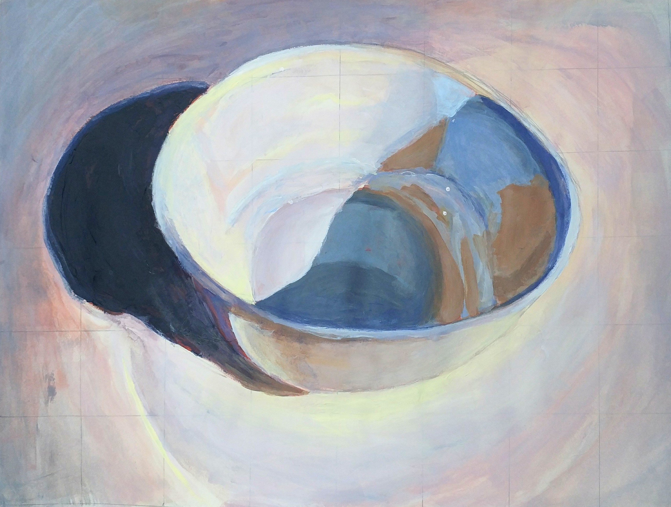
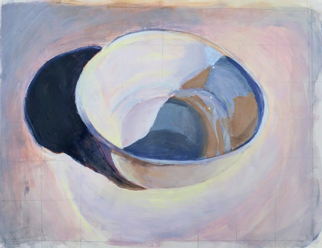
this is seriously beautiful, J! I love how much you’ve exaggerated the temperatures and colors of the shadows, not only in the bowl itself but in the top left corner. I’m blown away and can’t wait to see the finished product!
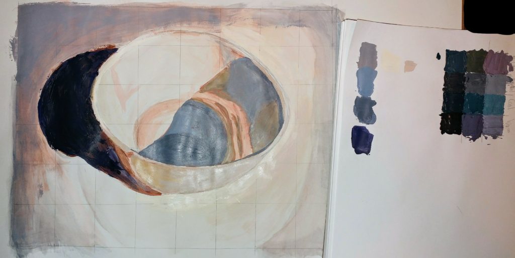
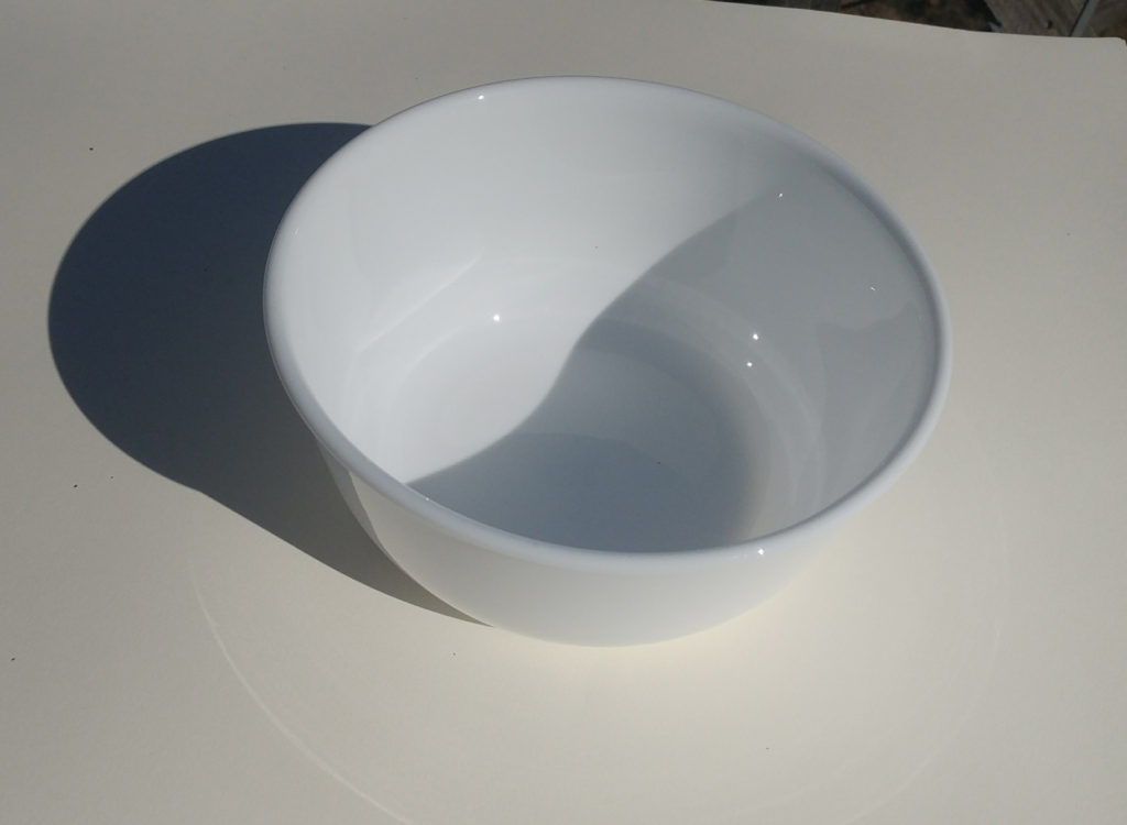
Thank you very much! I’m not sure it can be called a “gray” painting anymore, but it is definitely a painting, and it does kinda look like a bowl! I’ll be finessing some of the details in our next class (such as making the shadow shape right and fixing the top part of the bowl), but I’m really happy you like it so far!
This came out SO BEAUTIFULLY! The colors and contrast are so awesome, they’re really bright but at the same time subdued enough so they just look like shadow/light reflections. I love the peach and lavender tones. I’m excited to see what you do for the next reflective project, since you already have a really good grasp of reflection!
WOW this is too good! Seriously you took this photograph to the next level J! Perfect balance of saturation in your colored greys. I can’t stop looking at it, beautiful job 🙂
This is a marvelous painting, who knew that a bowl could have such energy and feeling! I am so pleased with the myriad of colors and temperatures that you found in gray. You activated the entire composition and allowed the brush stroke to create the forms and shapes.
I look forward to seeing how you will use saturated color in the Transparency Project.
Bravo-keep up the good work!
5 Comments
this is seriously beautiful, J! I love how much you’ve exaggerated the temperatures and colors of the shadows, not only in the bowl itself but in the top left corner. I’m blown away and can’t wait to see the finished product!
Thank you very much! I’m not sure it can be called a “gray” painting anymore, but it is definitely a painting, and it does kinda look like a bowl! I’ll be finessing some of the details in our next class (such as making the shadow shape right and fixing the top part of the bowl), but I’m really happy you like it so far!
This came out SO BEAUTIFULLY! The colors and contrast are so awesome, they’re really bright but at the same time subdued enough so they just look like shadow/light reflections. I love the peach and lavender tones. I’m excited to see what you do for the next reflective project, since you already have a really good grasp of reflection!
WOW this is too good! Seriously you took this photograph to the next level J! Perfect balance of saturation in your colored greys. I can’t stop looking at it, beautiful job 🙂
This is a marvelous painting, who knew that a bowl could have such energy and feeling! I am so pleased with the myriad of colors and temperatures that you found in gray. You activated the entire composition and allowed the brush stroke to create the forms and shapes.
I look forward to seeing how you will use saturated color in the Transparency Project.
Bravo-keep up the good work!