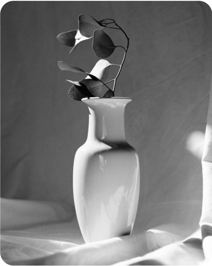
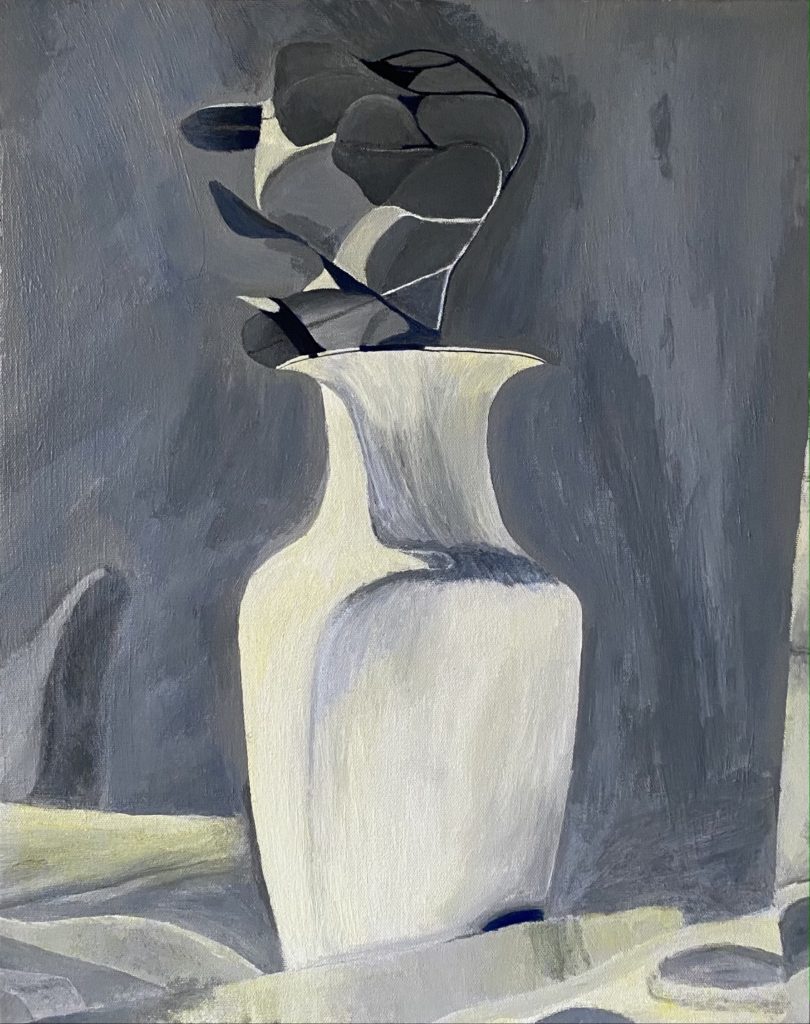
The colors I combined above were yellow and blue. For the darker parts of the painting I used the blue, and for the lighter parts I used yellow.
Art 035 // Spring 2021 // MURPHY
The colors I combined above were yellow and blue. For the darker parts of the painting I used the blue, and for the lighter parts I used yellow.
4 Comments
Love the balance of warm and cool, looks great!
I love how it looks delicate and smooth, but that is juxtaposed with the texture of the paint and the canvas raising!
This came out awesome! I love the way you blended the paint to give the painting a sleek texture.
This painting turned out so well. I love the hard and soft edges and the warm and cool color play.
I only wish you were able to do the soap bottle painting as I am sure it would have been a wonderful color theory investigation.